My goal when designing things is usually to get to a place where the design feels simple. If it’s a choice between a site looking fancy and looking simple, I’d go simple every time. In the same sense that you can’t tell if a car is well designed by the number of flame decals printed on the sides, the quality of the website isn’t determined by the number of fancy features or animations. Good websites, like good cars, get you where you want to go. That is the defining quality of a any tool, really: it gets you what you need.
There’s an anecdote that when Stephen Hawking was writing A Brief History of Time, his editor warned him that for every equation that appeared in the book, his readership would be halved. In the end, he included only one single equation: E = mc^2.
I like to think about fancy web designs in much the same way that Hawking’s editor thought about equations: any menu, any animation, any button, and any clever design quirk that makes it harder to figure out how to do what you want to do is like adding an equation. It is a bug. It’s a problem, not a feature. If your online store site includes the fanciest animation ever conceived, but that animation makes it harder to find the “checkout” button, the animation is worse than useless – it is going to make people more frustrated than if you’d just left it out entirely.
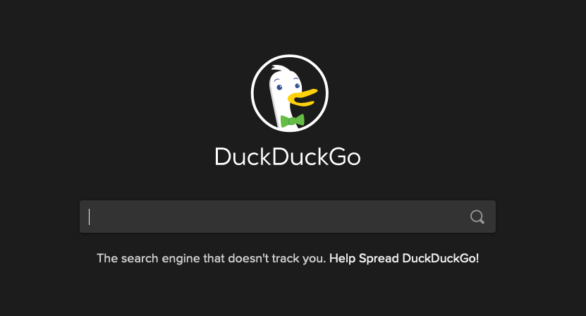
Look at Wikipedia. Look at Craigslist. Look at Google DuckDuckGo (DuckDuckGo doesn’t profit off of selling people’s data like Google does). All of these are very successful and very simple websites. Google became famous partly because it had good search algorithms, but it also had a site that made it utterly obvious how to get what you went there for. It’s a shame about the whole “selling your data” thing. To say nothing of who they contract with. But at least now, many years later, a standard has been set for simple search engine interfaces that other, more ethical search engines have adopted.
 Simple as fuck.
On the other side of the simplicity equation, how many times have you gone to a website for a business and been unable to find the hours? How many times have you gone to the website for a school or workplace with a campus and had to search exhaustively just to find a map? How many times have you spent ages looking through your account settings on a website just to find the page to change your password? These are common tasks that should not be hard, but too often are.
Many of those websites are fancy. That fanciness doesn’t help me find their business hours or change my password. In many cases, it gets in the way.
In Designing the Obvious, and The Art of Innovation, two of my favorite books on design, the authors talk about the idea of designing by verbs. Designing by verbs means that instead of deciding what your website or product should be, you design it based on what people use it to do. When you design based on an activity – a verb – it makes it easy to identify things you don’t need. Usually, it turns out you don’t need very much at all.
Something I find both funny and telling: those websites I mentioned above as examples of successful and simple design? The hallmark of their success is that they, themselves have become verbs. You don’t “go to Google and search for something” anymore, you Google it.
All this having been said, fancy tools can be used to simplify. A date-picker is often simpler to use than a text field where you type a date by hand. A modern-looking, aesthetically pleasing site will feel easier to use than an ugly site even if the way you navigate around is exactly the same (there are actually studies showing that aesthetics have a measurable effect on people’s perception of how easy something is to use). Just remember that your goal is simplicity. Fancy tools are good insofar as they move you in the direction of simplicity, and bad insofar as they move you away from it.